PLENITUDE
Redesigning the digital journey for Plenitude’s energy offer listing and product pages through user-tested UI/UX improvements.
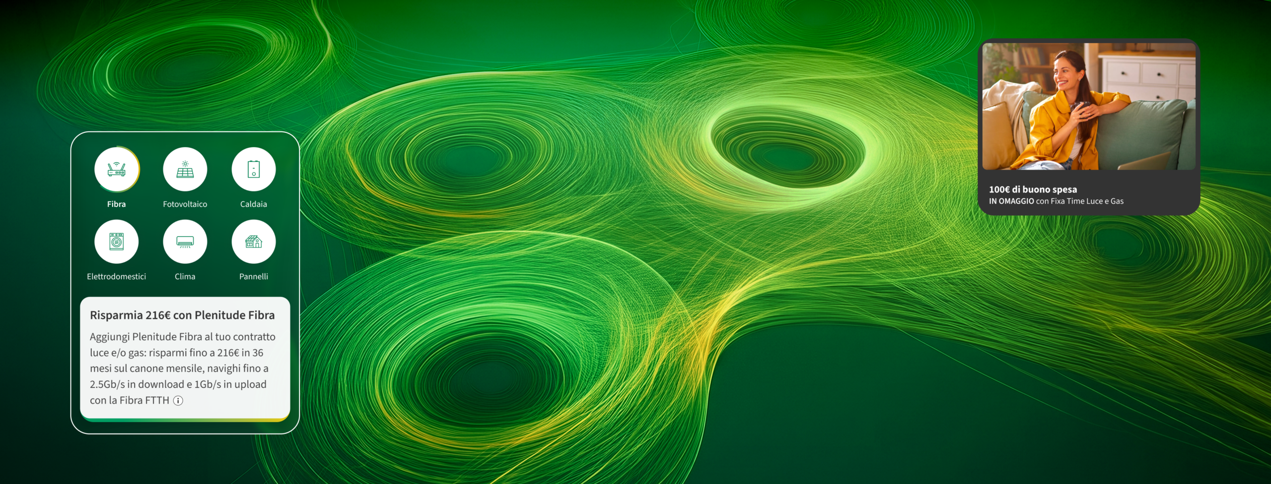
THE CHALLANGE
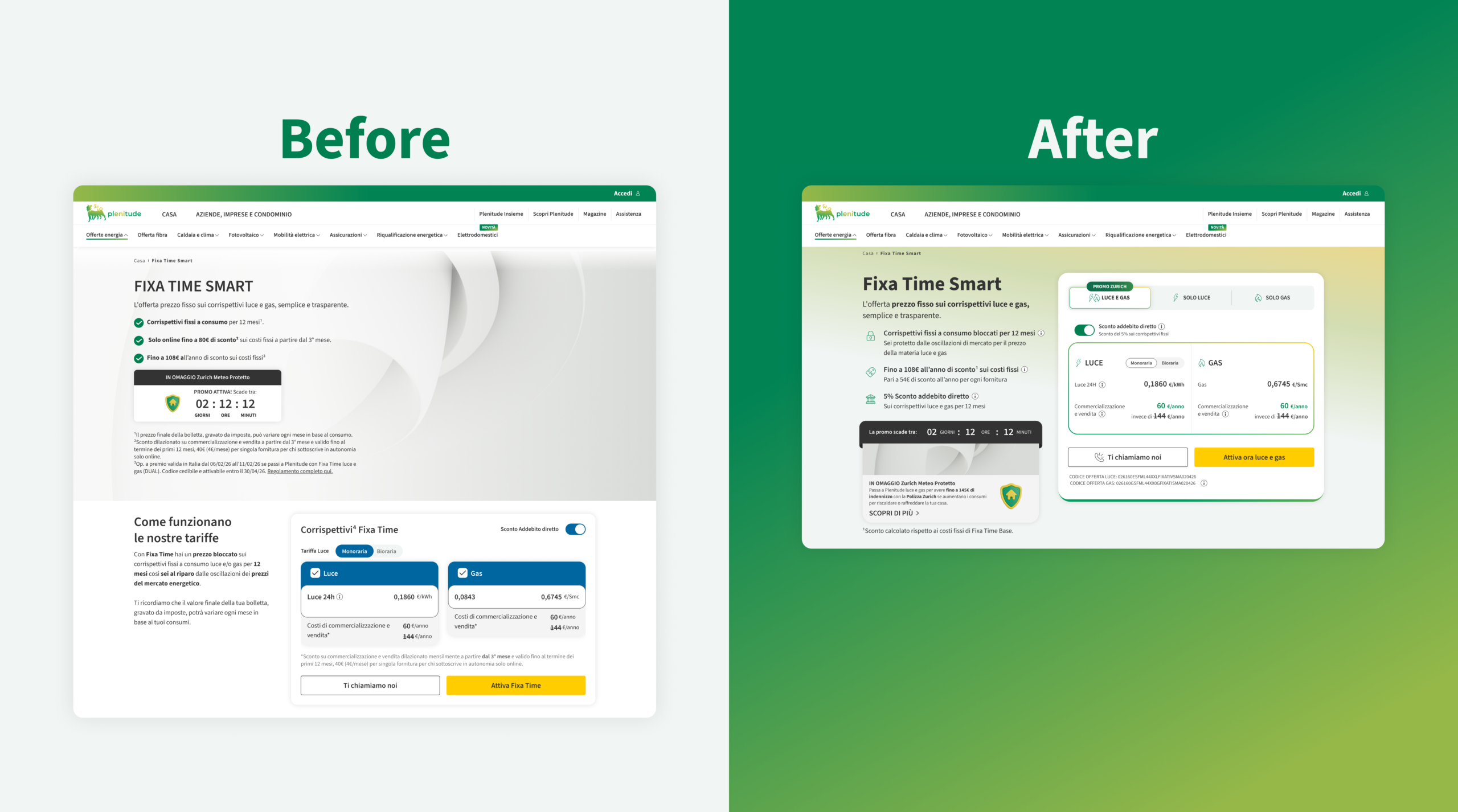
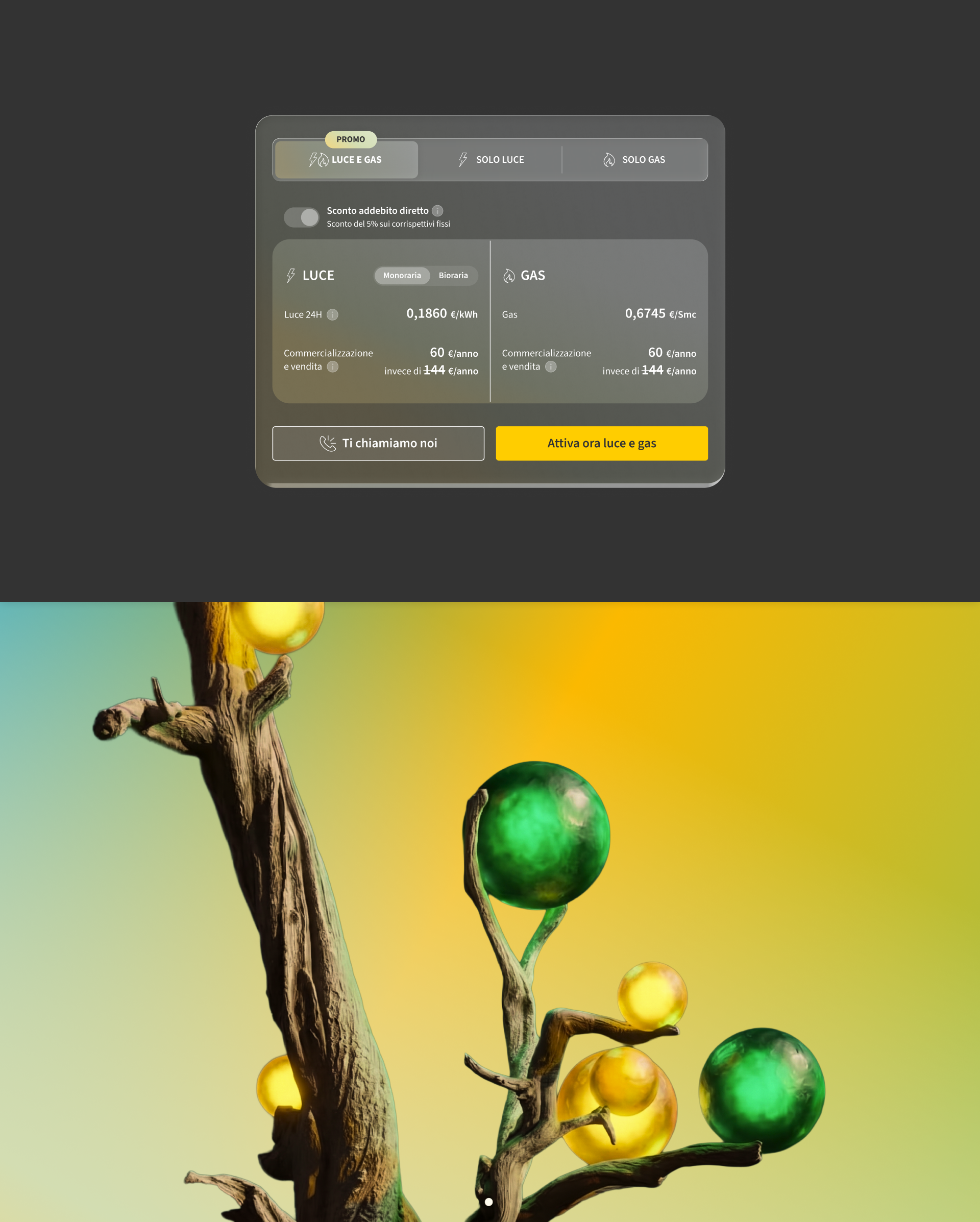
ELEVATING THE UTILITY SEARCH & SELECTION EXPERIENCE
The main challenge was to rethink and optimize the user journey for Plenitude's core digital touchpoints: the Offer Listing Page (PLP) and the Product Detail Page (PDP). Energy plans can often feel complex or overwhelming to users due to technical details, varying tariffs, and fine print.
The goal was to eliminate choice paralysis, streamline offer comparison, and make the value proposition of each plan immediately clear and transparent through a modernized UX/UI architecture.
MY ROLE
USER-CENTERED DESIGN & TEST-DRIVEN ITERATION
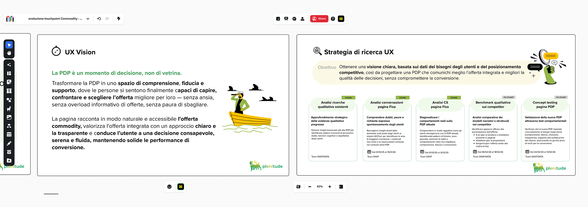
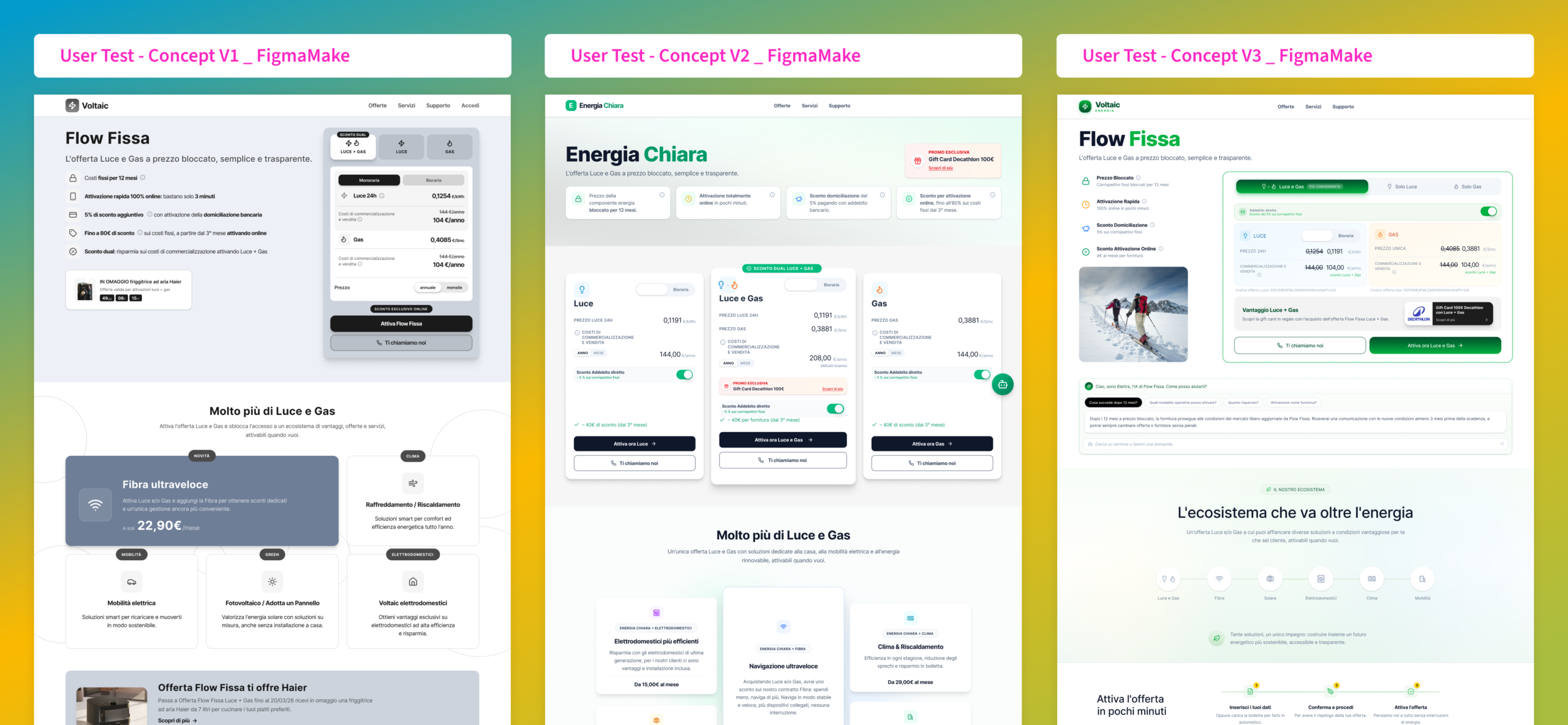
In this project, I worked as a UX/UI Designer leading the redesign of the listing and product experience. Before finalizing the high-fidelity UI, we developed multiple concept proposals and validated them through structured user testing sessions. This empirical approach allowed us to identify user friction early and refine the interfaces based on real behavior.
• UX Assessment & Benchmarking
• Concept Exploration & User Testing
• Listing Page (PLP) Architecture
• Product Detail Page (PDP) Redesign
• High-Fidelity Prototyping
• Dev-Team Handoff & Specs
FOCUS
VALIDATED CONCEPTS & CONVERSION-DRIVEN UI
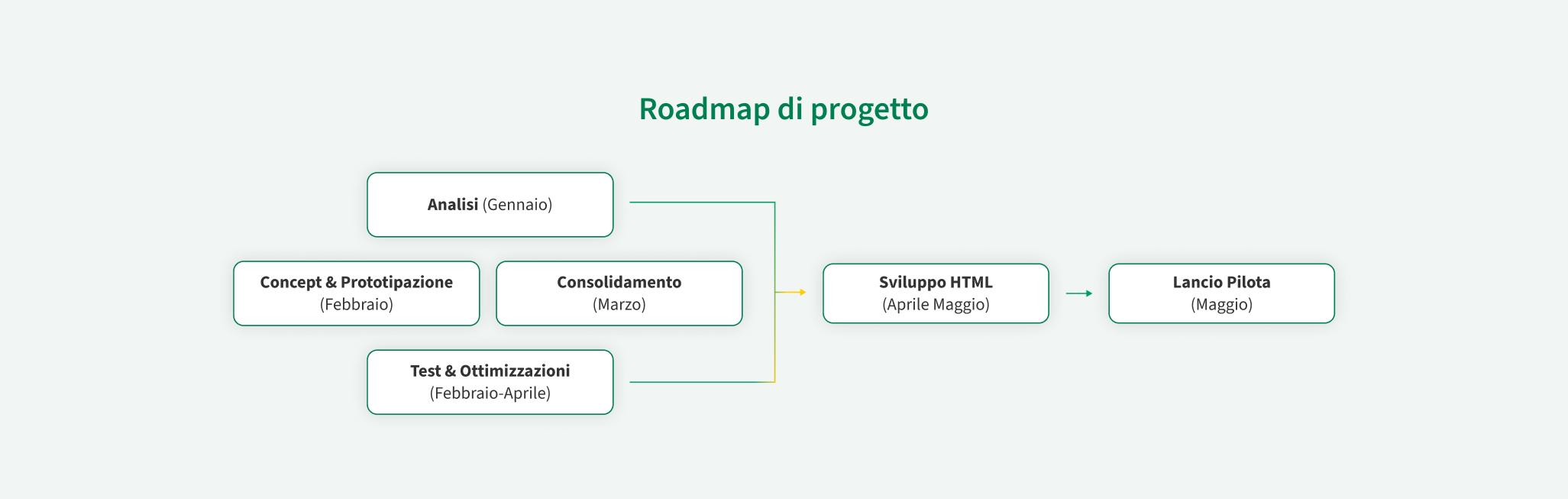
The backbone of the project was an iterative, test-driven methodology. By building interactive prototypes in Figma and testing our initial proposals with real users.
1. Discovery & Figma Prototyping: Interactive Figma prototypes and usability tests to identify user friction points.
2. Definition: Data analysis to optimize information hierarchy, filters, and plan comparisons.
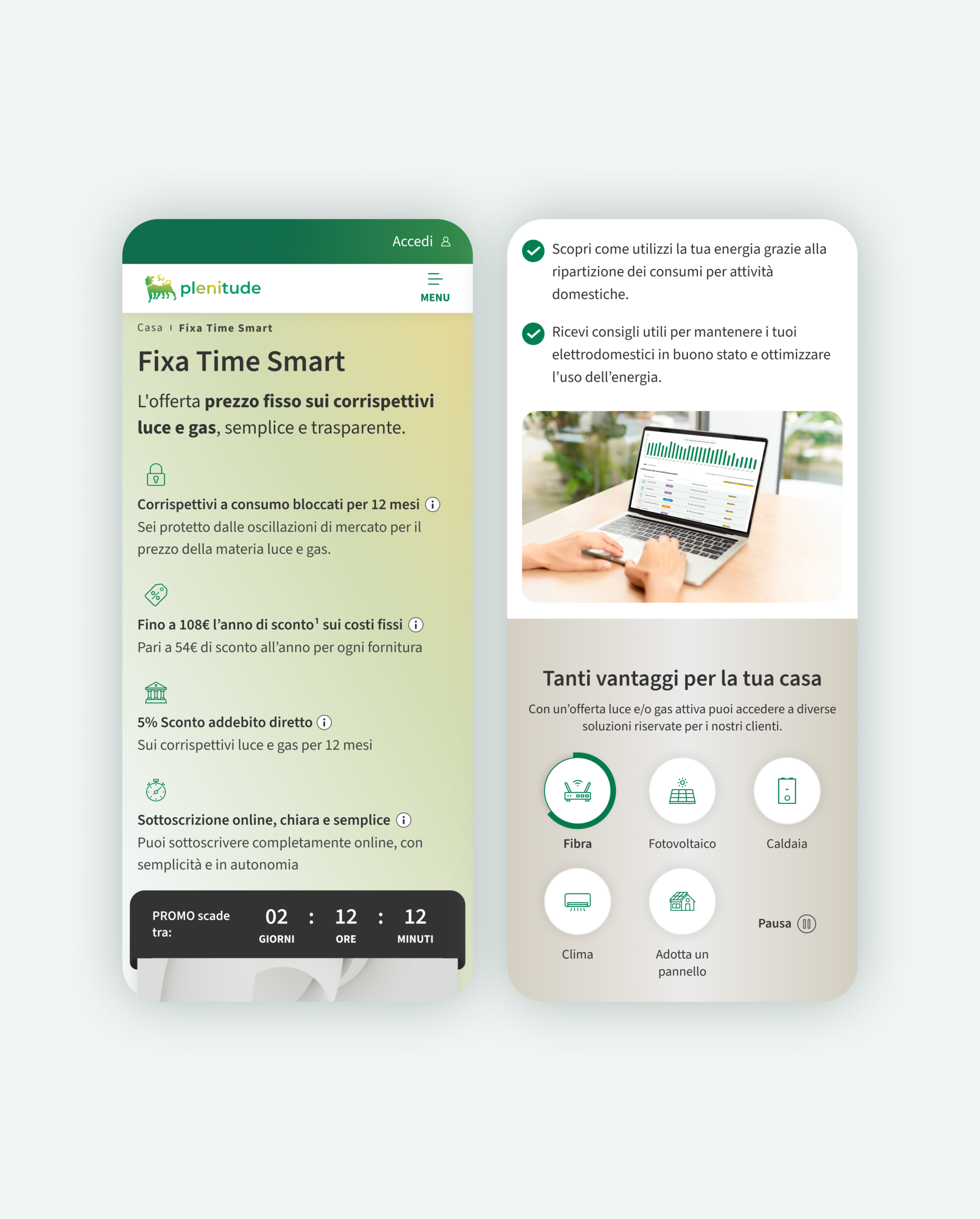
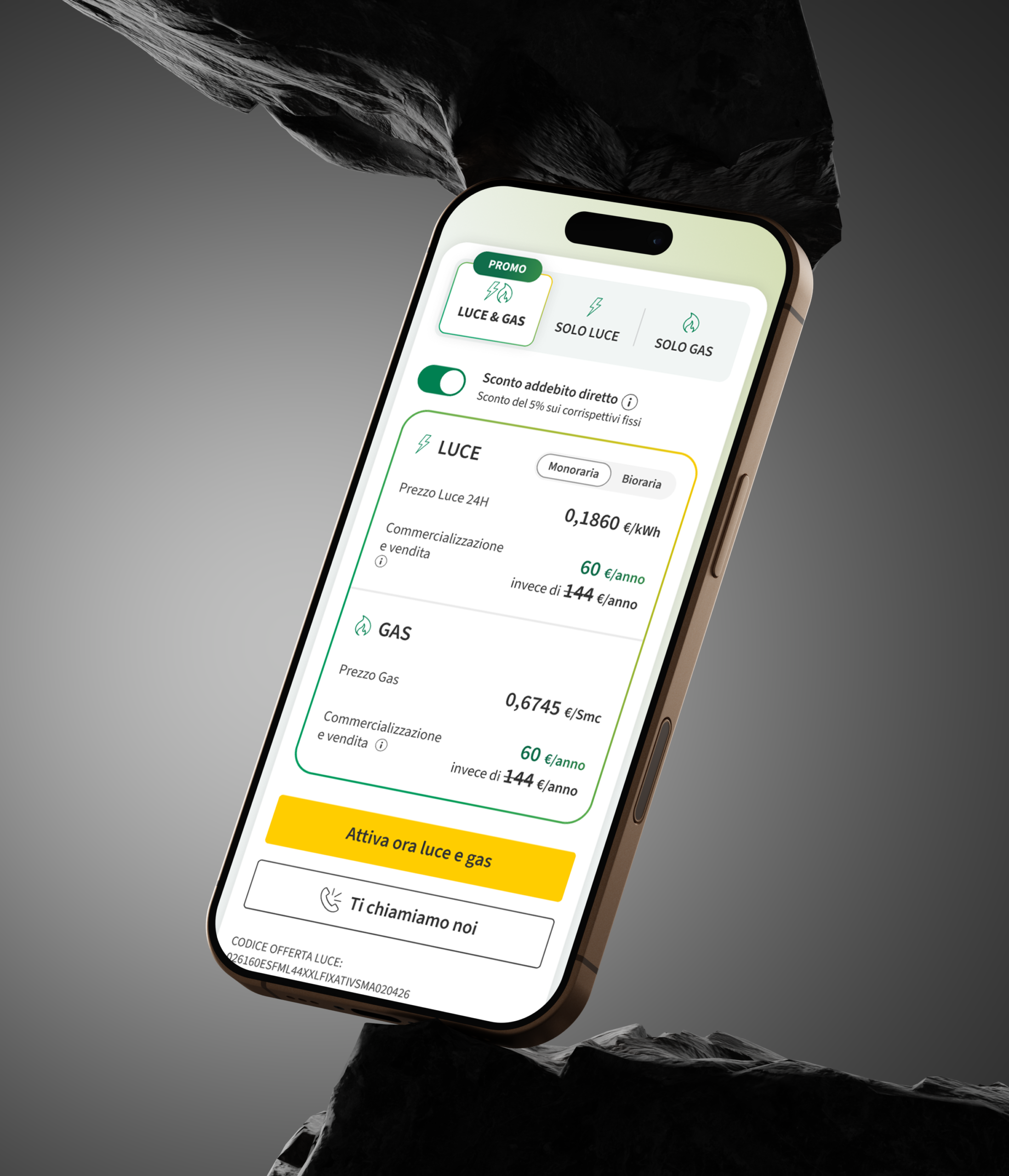
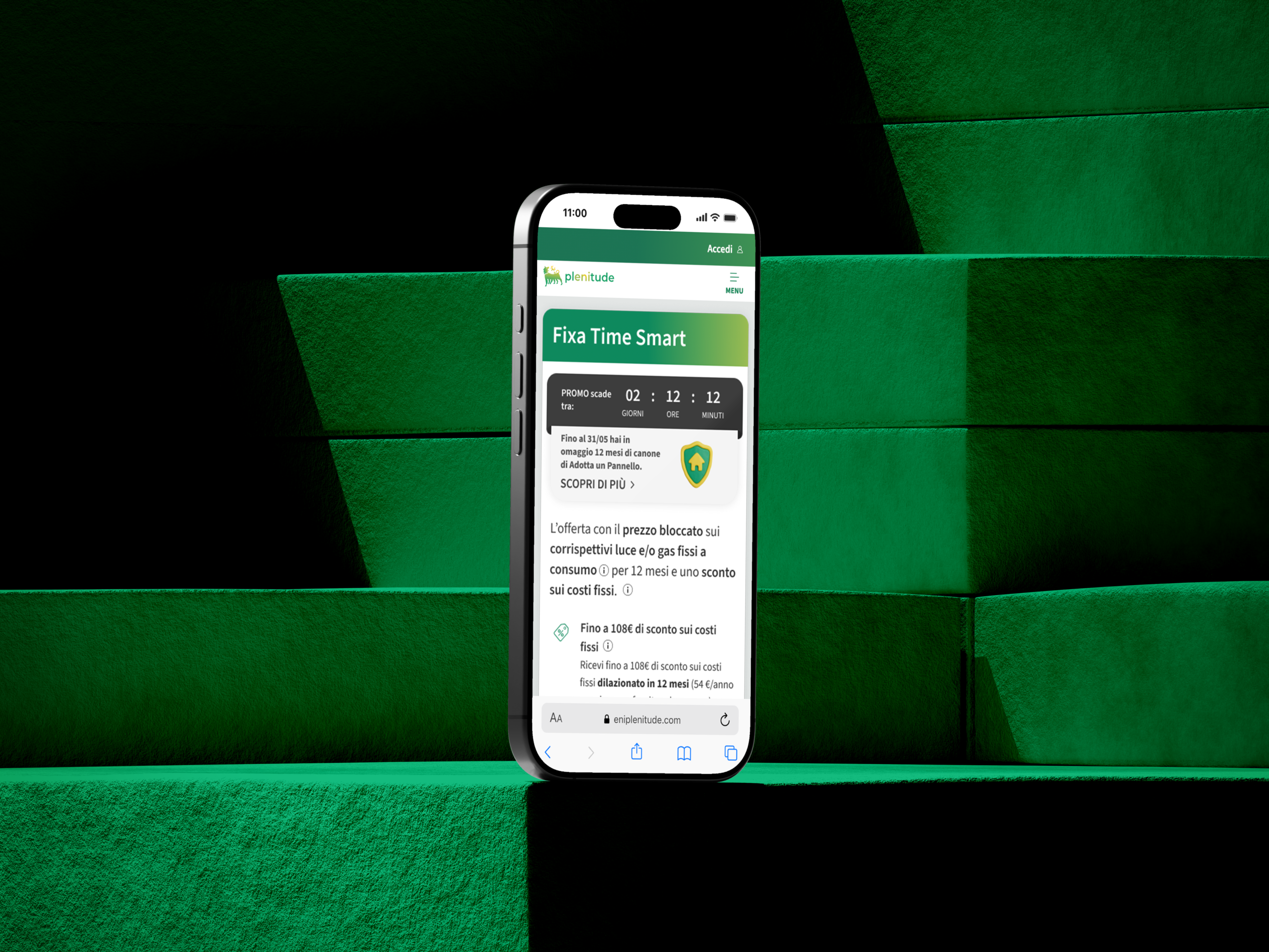
3. Design: Redesign of the Listing Page (cards and filters) and PDP (focus on savings).
4. Validation: Final refinements based on feedback and developer handoff.
Discovery
Figma Prototyping & Initial Usability Testing on Offer Listing Concepts.
Definition
User Journey Mapping, Tariff Friction & Pain Point Identification.
Design
High-Fidelity PLP & PDP Redesign with Clear Pricing Hierarchy.
Validation
Iterative Testing via Figma Prototypes & Dev Handoff Specs.
IMPACT
RESULTS THROUGH DESIGN
The redesigned listing and product pages significantly improved the user experience, making plan selection intuitive while driving business conversion.
Clearer Offer Comparison: Redesigned PLP cards and dynamic filters that reduce decision fatigue.
Empirical Validation: Every core UX decision was grounded in user testing results rather than assumptions.
Enhanced Pricing Transparency: Restructured PDP layout that clearly breaks down monthly costs, savings, and sustainability features.
Design Consistency: Seamless alignment with Plenitude's modern visual brand identity and digital design system.
+35%
Conversion Rate: Significant increase in plan sign-ups starting from the PDP.
-40%
Selection Friction: Drop in bounce rate on the Offer Listing Page thanks to better filtering.
+50%
User Clarity: High satisfaction score in post-test comprehension of tariff structures.
100%
User Tested: Key journeys validated and refined through user testing before roll-out.
REFLECTION
WHAT I TOOK AWAY
Designing for the energy sector reinforced that clarity is the ultimate form of user delight. By placing user testing at the front of our process, we transformed complex utility options into a straightforward, reassuring decision-making flow. Validating initial concepts early saved time, eliminated guesswork, and ensured that the final PLP and PDP delivered real value to both the users and Plenitude.
ARCHIVE
LET'S TALK!
2026 Copyrights Davide D'Eramo